Setting The Viewport
<meta name="viewport" content="width=device-width, initial-scale=1.0">
Responsive Images
Responsive images are images that scale nicely to fit any browser size.
Using the width Property
If the CSS width property is set to 100%, the image will be responsive and scale up and down:
<img src="img_girl.jpg" style="width:100%;">
รูปจะแสดงกว้างเต็มหน้าจอ (สัดส่วนอาจถูกขยาย ไม่ได้แสดงสัดส่วนที่ชัดที่สุด) แก้โดยใส่ max-width
Notice that in the example above, the image can be scaled up to be larger than its original size. A better solution, in many cases, will be to use the max-width property instead.
Using the max-width Property
If the max-width property is set to 100%, the image will scale down if it has to, but never scale up to be larger than its original size:
<img src="img_girl.jpg" style="max-width:100%;height:auto;">
Show Different Images Depending on Browser Width
(รูปต่างกัน เมื่อหน้าจอเปลียนไป)
<picture>
  <source srcset="img_smallflower.jpg" media="(max-width: 600px)">
  <source srcset="img_flowers.jpg" media="(max-width: 1500px)">
  <source srcset="flowers.jpg">
  <img src="img_smallflower.jpg" alt="Flowers">
</picture>
Responsive Text Size
<h1 style="font-size:10vw">Hello World</h1>
Media Queries
code
<style>
.left, .right {
float: left;
width: 20%; /* The width is 20%, by default */
}
.main {
float: left;
width: 60%; /* The width is 60%, by default */
}
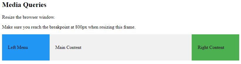
/* Use a media query to add a breakpoint at 800px: */
@media screen and (max-width: 800px) {
.left, .main, .right {
width: 100%; /* The width is 100%, when the viewport is 800px or smaller */
}
}
</style>ตัวอย่าง
<!DOCTYPE html>
<html>
<meta name="viewport" content="width=device-width, initial-scale=1.0">
<style>
* {
box-sizing:border-box;
}
.left {
background-color:#2196F3;
padding:20px;
float:left;
width:20%; /* The width is 20%, by default */
}
.main {
background-color:#f1f1f1;
padding:20px;
float:left;
width:60%; /* The width is 60%, by default */
}
.right {
background-color:#4CAF50;
padding:20px;
float:left;
width:20%; /* The width is 20%, by default */
}
/* Use a media query to add a break point at 800px: */
@media screen and (max-width:800px) {
.left, .main, .right {
width:100%; /* The width is 100%, when the viewport is 800px or smaller */
}
}
</style>
<body>
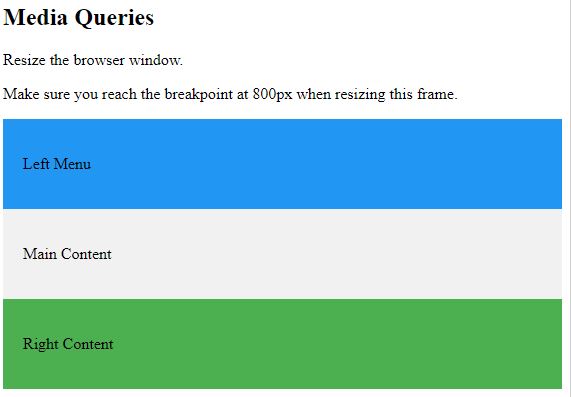
<h2>Media Queries</h2>
<p>Resize the browser window.</p>
<p>Make sure you reach the breakpoint at 800px when resizing this frame.</p>
<div class="left">
<p>Left Menu</p>
</div>
<div class="main">
<p>Main Content</p>
</div>
<div class="right">
<p>Right Content</p>
</div>
</body>
</html>
ตัวอย่างข้างบน เอาไปใช้กับ หน้า single.php ของ wordpress เพื่อทำ responsive
Responsive Web Page – Full Example

<!DOCTYPE html>
<html>
<head>
<meta name="viewport" content="width=device-width, initial-scale=1.0">
<style>
* {
  box-sizing: border-box;
}
.menu {
  float:left;
  width:20%;
  text-align:center;
}
.menu a {
  background-color:#e5e5e5;
  padding:8px;
  margin-top:7px;
  display:block;
  width:100%;
  color:black;
}
.main {
  float:left;
  width:60%;
  padding:0 20px;
}
.right {
  background-color:#e5e5e5;
  float:left;
  width:20%;
  padding:15px;
  margin-top:7px;
  text-align:center;
}

@media only screen and (max-width:620px) {
  /* For mobile phones: */
  .menu, .main, .right {
    width:100%;
  }
}
</style>
</head>
<body style="font-family:Verdana;color:#aaaaaa;">

<div style="background-color:#e5e5e5;padding:15px;text-align:center;">
  <h1>Hello World</h1>
</div>

<div style="overflow:auto">
  <div class="menu">
    <a href="#">Link 1</a>
    <a href="#">Link 2</a>
    <a href="#">Link 3</a>
    <a href="#">Link 4</a>
  </div>

  <div class="main">
    <h2>Lorum Ipsum</h2>
    <p>Lorem ipsum dolor sit amet, consectetuer adipiscing elit, sed diam nonummy nibh euismod tincidunt ut laoreet dolore magna aliquam erat volutpat.</p>
  </div>

  <div class="right">
    <h2>About</h2>
    <p>Lorem ipsum dolor sit amet, consectetuer adipiscing elit.</p>
  </div>
</div>

<div style="background-color:#e5e5e5;text-align:center;padding:10px;margin-top:7px;">© copyright w3schools.com</div>

</body>
</html>
Responsive Web Design – Frameworks
(ใช้กับหน้าที่เป็น column)
<!DOCTYPE html>
<html>
<title>W3.CSS</title>
<meta name="viewport" content="width=device-width, initial-scale=1">
<link rel="stylesheet" href="https://www.w3schools.com/w3css/4/w3.css">
<body>
<div class="w3-container w3-green">
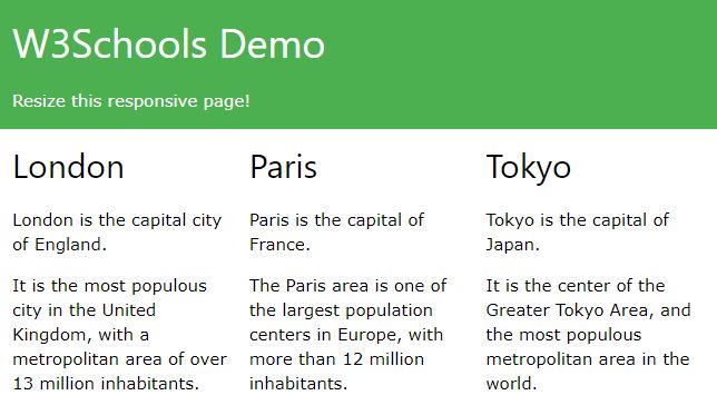
<h1>W3Schools Demo</h1>
<p>Resize this responsive page!</p>
</div>
<div class="w3-row-padding">
<div class="w3-third">
<h2>London</h2>
<p>London is the capital city of England.</p>
<p>It is the most populous city in the United Kingdom,
with a metropolitan area of over 13 million inhabitants.</p>
</div>
<div class="w3-third">
<h2>Paris</h2>
<p>Paris is the capital of France.</p>
<p>The Paris area is one of the largest population centers in Europe,
with more than 12 million inhabitants.</p>
</div>
<div class="w3-third">
<h2>Tokyo</h2>
<p>Tokyo is the capital of Japan.</p>
<p>It is the center of the Greater Tokyo Area,
and the most populous metropolitan area in the world.</p>
</div>
</div>
</body>
</html>
Bootstrap
<!DOCTYPE html>
<html lang="en">
<head>
<title>Bootstrap Example</title>
<meta charset="utf-8">
<meta name="viewport" content="width=device-width, initial-scale=1">
<link rel="stylesheet" href="https://maxcdn.bootstrapcdn.com/bootstrap/3.3.7/css/bootstrap.min.css">
<script src="https://ajax.googleapis.com/ajax/libs/jquery/3.2.0/jquery.min.js"></script>
<script src="https://maxcdn.bootstrapcdn.com/bootstrap/3.3.7/js/bootstrap.min.js"></script>
</head>
<body>

<div class="container">
  <div class="jumbotron">
    <h1>My First Bootstrap Page</h1>
  </div>
  <div class="row">
    <div class="col-sm-4">
      ...
    </div>
    <div class="col-sm-4">
      ...
    </div>
    <div class="col-sm-4">
    ...
    </div>
  </div>
</div>

</body>
</html>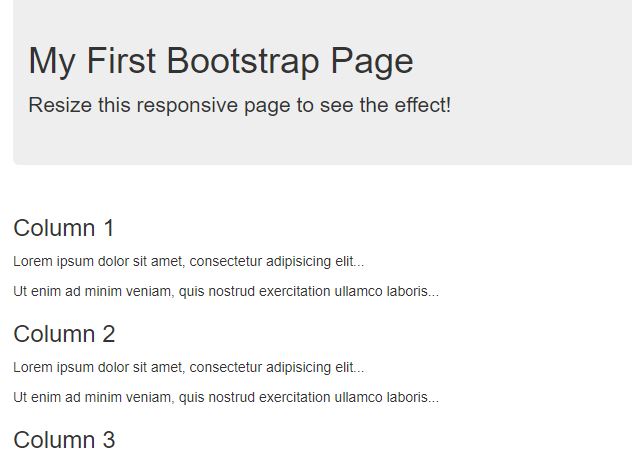
https://www.w3schools.com/html/html_responsive.asp